Bitcoin Price Prediction: Selling Pressure Meets Key Zone
Bitcoin looks weak in the short term as both spot and futures flows point lower, yet a separate monthly chart shows the market entering a historical accumulation area. Together, the setups suggest near term pressure may continue even as long term risk reward begins to improve.
Bitcoin Faces Fresh Selling Pressure as Spot and Futures Turn Lower
This chart shows selling pressure building in both the spot and futures markets at the same time. Ted Pillows points to that alignment as a bearish signal, and the data on the chart supports that view. Bitcoin fell sharply, and the two CVD lines moved lower with it instead of diverging in a bullish way.
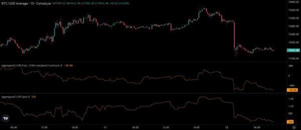
BTC/USD Average 15m with aggregated spot and futures CVD. Source: Ted Pillows on X
The top panel shows price breaking down after trading near the local highs. Then the middle panel, which tracks aggregated futures CVD for coin margined contracts, drops deep into negative territory. That suggests short pressure increased in the derivatives market. At the same time, the bottom panel, which tracks spot CVD, also trends lower. So this is not just a futures led move. Spot sellers are active too.
That combination matters because it shows weakness across both sides of the market. Sometimes price falls while spot buying absorbs the move, but that is not what this chart shows. Instead, spot appears to be selling into the drop while perps keep pressing lower. As a result, the structure looks heavier than a simple liquidation event.
The latest candles also support that reading. After the sharp selloff, Bitcoin only managed a weak sideways bounce instead of a strong recovery. That usually shows sellers still control the short term trend. Unless spot demand returns and futures pressure eases, the chart suggests Bitcoin may continue drifting lower.
Bitcoin Enters Historical Accumulation Zone as Long Term Risk Reward Improves
Titan of Crypto’s monthly chart argues that Bitcoin has moved back into a zone that previously aligned with long term accumulation periods. The setup does not call an exact bottom. Instead, it highlights a point where downside risk has historically started to shrink relative to the potential upside over a longer cycle.
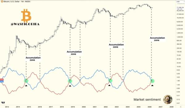
Bitcoin / U.S. Dollar 1M chart with market sentiment indicator. Source: Titan of Crypto on X
The chart compares past cycle phases using a market sentiment indicator with two oscillating lines. Each time the blue and red lines reached the marked crossover area, Bitcoin was entering or moving through an accumulation zone. Those signals appeared near prior cycle lows or broad base formations, not near euphoric tops. Because of that pattern, the latest signal suggests the market may be shifting away from the high risk part of the cycle and closer to a zone where patient buyers usually start paying more attention.
At the same time, the chart does not rule out more weakness first. The analyst says Bitcoin can still go lower, and the structure supports that caution. Accumulation zones are usually processes, not single turning points. In past cycles, price did not always reverse immediately after entering this area. Instead, Bitcoin often spent time stabilizing before the next sustained advance began.
So the main takeaway is about positioning, not certainty. This chart suggests Bitcoin has entered a part of the cycle where long term risk reward begins to improve based on historical behavior. However, confirmation would still depend on how price behaves through the rest of the base building phase.